
Grid Items 정렬하기
004.html
<!DOCTYPE html>
<html lang="en">
<head>
<meta charset="UTF-8" />
<meta http-equiv="X-UA-Compatible" content="IE=edge" />
<meta name="viewport" content="width=device-width, initial-scale=1.0" />
<link rel="stylesheet" href="004.css" />
<title>Grid</title>
</head>
<body>
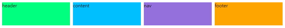
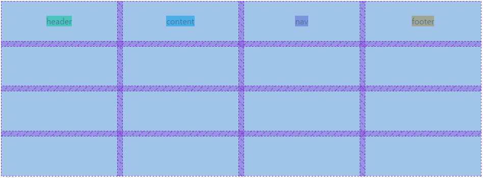
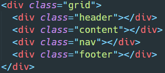
<div class="grid">
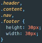
<div class="header">header</div>
<div class="content">content</div>
<div class="nav">nav</div>
<div class="footer">footer</div>
</div>
</body>
</html>004.css
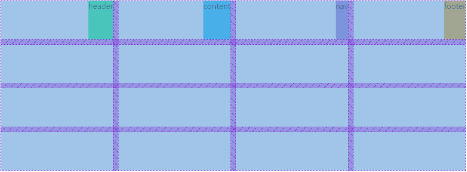
.grid {
  display: grid;
  gap: 10px;
  height: 50vh;
  grid-template-columns: repeat(4, 1fr);
  grid-template-rows: repeat(4, 1fr);
}

.header {
  background-color: springgreen;
}

.content {
  background-color: deepskyblue;
}

.nav {
  background-color: mediumpurple;
}

.footer {
  background-color: orange;
}

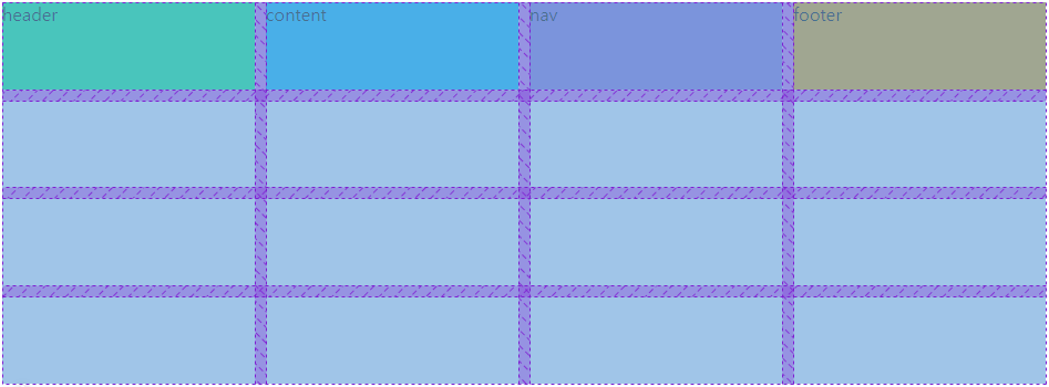
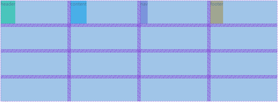
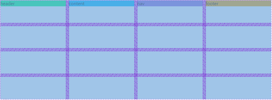
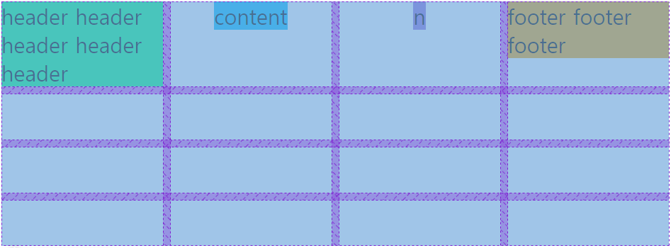
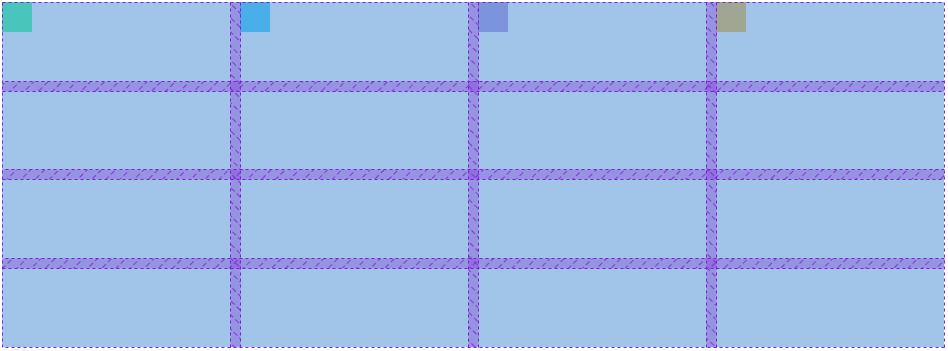
justify-items
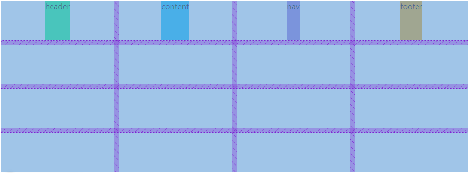
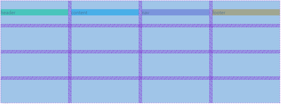
align-items

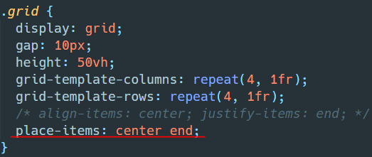
place-items


Block 요소와 Stretch 옵션


참고
justify-items - CSS: Cascading Style Sheets | MDN
The CSS justify-items property defines the default justify-self for all items of the box, giving them all a default way of justifying each box along the appropriate axis.
developer.mozilla.org
align-items - CSS: Cascading Style Sheets | MDN
The CSS align-items property sets the align-self value on all direct children as a group. In Flexbox, it controls the alignment of items on the Cross Axis. In Grid Layout, it controls the alignment of items on the Block Axis within their grid area.
developer.mozilla.org
place-items - CSS: Cascading Style Sheets | MDN
The CSS place-items shorthand property allows you to align items along both the block and inline directions at once (i.e. the align-items and justify-items properties) in a relevant layout system such as Grid or Flexbox. If the second value is not set, the
developer.mozilla.org
'개발(Web) > Web' 카테고리의 다른 글
| [CSS] Grid Item 정렬하기 (0) | 2022.01.21 |
|---|---|
| [CSS] Grid Container 정렬하기 (0) | 2022.01.20 |
| [CSS] Grid Template (0) | 2022.01.18 |
| [CSS] Grid Item (0) | 2022.01.17 |
| [CSS] Grid Container (0) | 2022.01.16 |