
Grid Container 정렬하기
004.html
<!DOCTYPE html>
<html lang="en">
<head>
<meta charset="UTF-8" />
<meta http-equiv="X-UA-Compatible" content="IE=edge" />
<meta name="viewport" content="width=device-width, initial-scale=1.0" />
<link rel="stylesheet" href="004.css" />
<title>Grid</title>
</head>
<body>
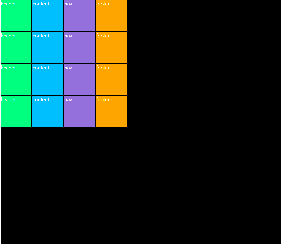
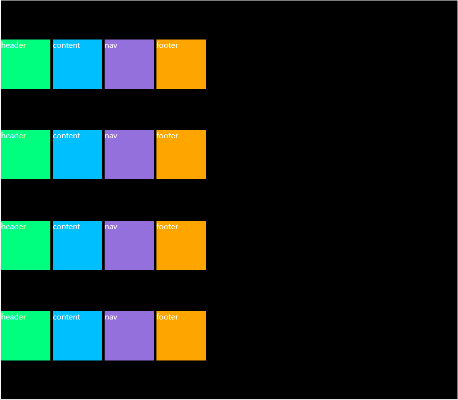
<div class="grid">
<div class="header">header</div>
<div class="content">content</div>
<div class="nav">nav</div>
<div class="footer">footer</div>
</div>
</body>
</html>004.css
.grid {
background-color: black;
color: white;
display: grid;
gap: 5px;
height: 50vh;
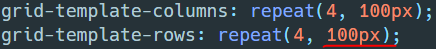
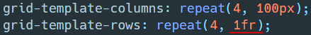
grid-template-columns: repeat(4, 100px);
grid-template-rows: repeat(4, 100px);
}
.header {
background-color: springgreen;
}
.content {
background-color: deepskyblue;
}
.nav {
background-color: mediumpurple;
}
.footer {
background-color: orange;
}
justify-content


align-content


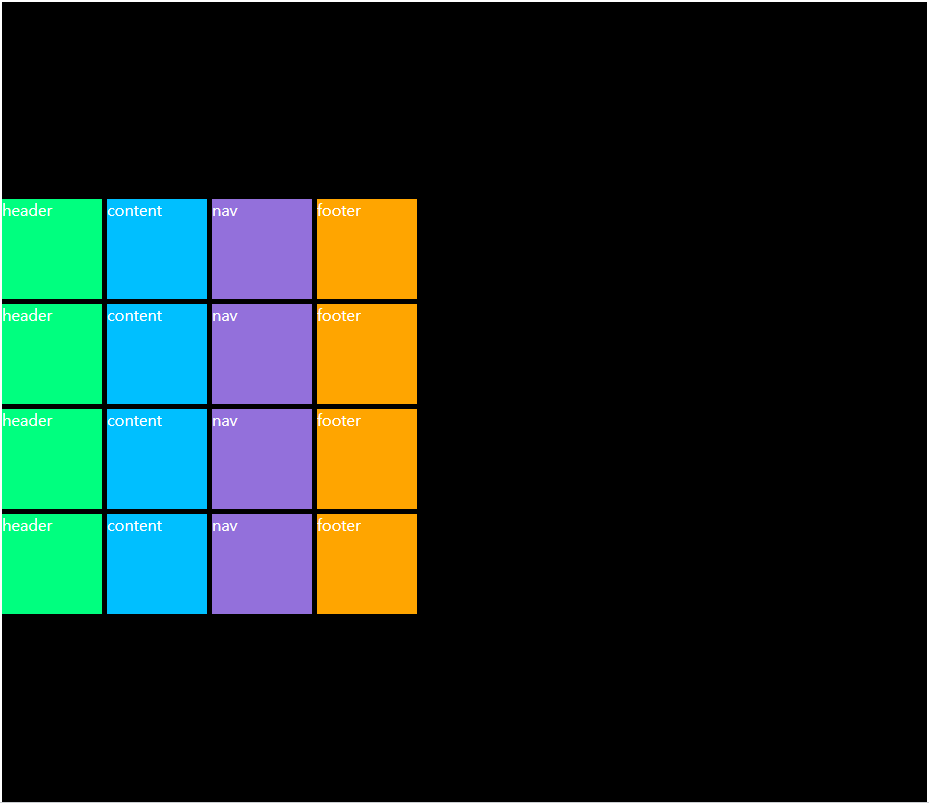


place-content


참고
justify-content - CSS: Cascading Style Sheets | MDN
The CSS justify-content property defines how the browser distributes space between and around content items along the main-axis of a flex container, and the inline axis of a grid container.
developer.mozilla.org
align-content - CSS: Cascading Style Sheets | MDN
The CSS align-content property sets the distribution of space between and around content items along a flexbox's cross-axis or a grid's block axis.
developer.mozilla.org
place-content - CSS: Cascading Style Sheets | MDN
The place-content CSS shorthand property allows you to align content along both the block and inline directions at once (i.e. the align-content and justify-content properties) in a relevant layout system such as Grid or Flexbox.
developer.mozilla.org
'개발(Web) > Web' 카테고리의 다른 글
| [CSS] Grid 자동정렬 (0) | 2022.01.22 |
|---|---|
| [CSS] Grid Item 정렬하기 (0) | 2022.01.21 |
| [CSS] Grid Items 정렬하기 (0) | 2022.01.19 |
| [CSS] Grid Template (0) | 2022.01.18 |
| [CSS] Grid Item (0) | 2022.01.17 |